

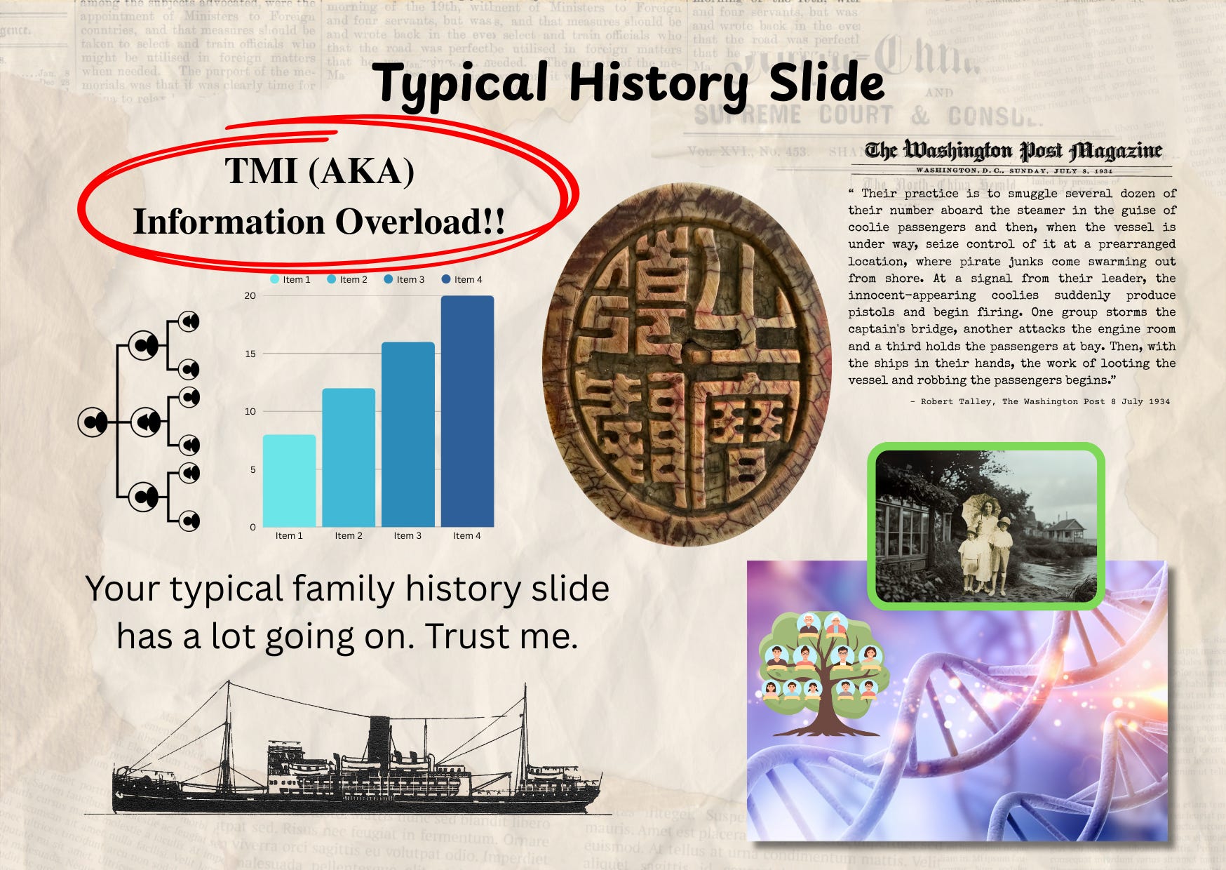
Let’s be honest. Most family history slides look like the inside of an overstuffed filing cabinet — crammed with names, dates, trees, and bullet points. We tell ourselves, “But it’s important! People need to know all this!” Yet the truth is, loaded slides are counter-productive. Viewers may be switching off. This is particularly true during webinars where attentions wander.
Your audience doesn’t want a bubble machine. They want your stories; to see your great-grandmother’s wedding photo and learn about the context of her life. They don’t want phoney images and a wall of text about her birthdate, maiden name, and the census she appeared in.
Thanks for reading Show & Tell! Subscribe for free to receive new posts and support my work.
I love creating slides, and that’s part of my problem. When you love something, it’s hard to let go of your darlings, your precious ideas.
In my former career as a journalist, I worked for a public (government-funded) broadcaster. I don’t remember who gave me this advice, but it was to ask yourself ‘Who am I making this for?” I think it’s a useful prompt for family history storytellers.
Here’s the trick: every time you’re about to add another chart or photo to a busy slide, considering painting a picture: show instead of tell: a photo, a map, even a scanned letter will hold attention far longer than a list or a vomit of text.
The Science
Psychologists call it the picture superiority effect: people tend to remember images more easily than words. And Dual Coding theory explains why, when you encode an idea both verbally and visually, you lay down two memory paths, doubling the chances of recall. In his book Brain Rules, John Medina sums it up with a memorable comparison: hear a piece of information and three days later you’ll likely remember only 10%, but add a picture and recall can jump to around 65%.
What Loaded Slides Do
Attention shifts to the slide, not the speaker - the audience reads instead of listening.
Split attention - audience’s visual and verbal channels compete, reducing capacity to integrate what the speaker is saying.
Reduced memory encoding/recall - too many elements means nothing is processed deeply enough or anchored.
Confusing message - core points get buried under details, making it harder to follow the story.
Cognitive fatigue - if every slide demands high mental effort, audience gets worn down.
Less transfer/application - not just memory, but ability to apply or use the content suffers.
Miscommunication - critical facts or narrative threads can be lost or misunderstood.
Now Let’s Play
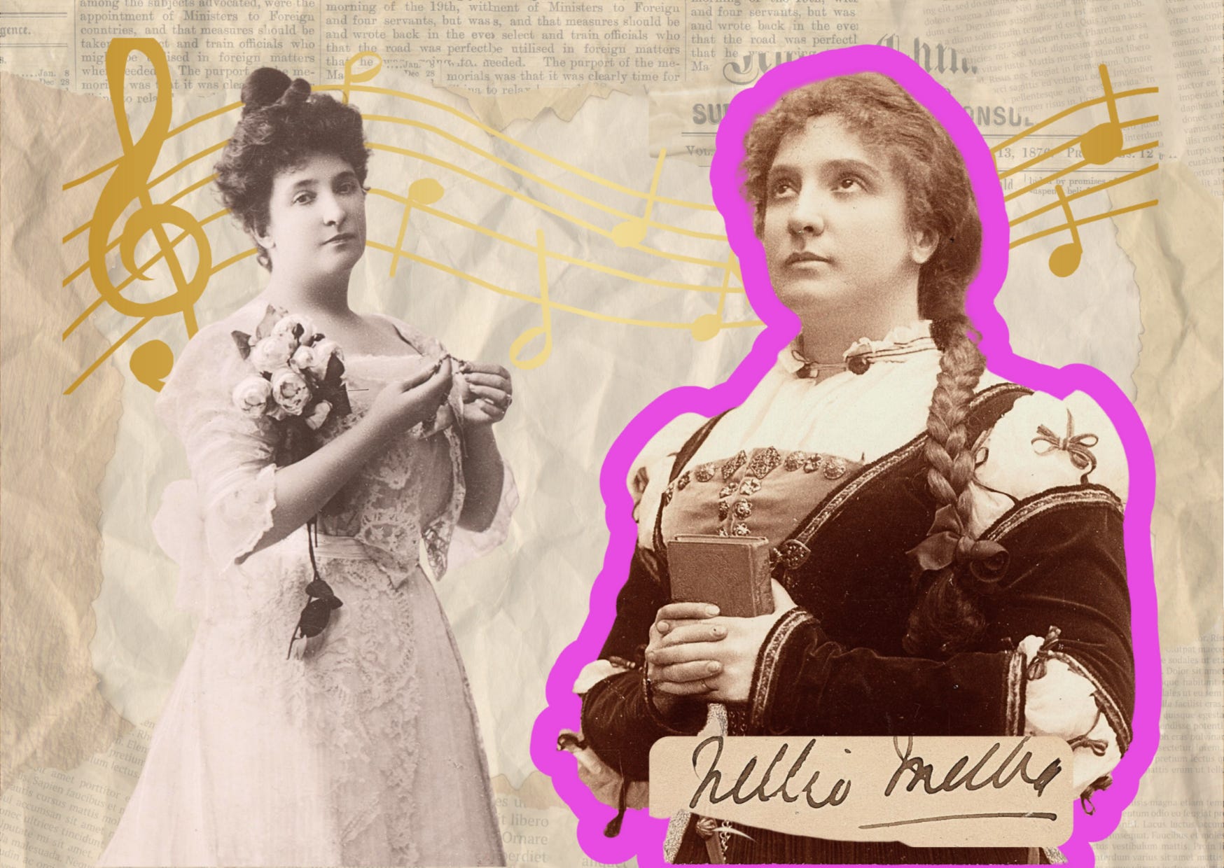
Let’s look at how we can strip away the clutter, trust the power of images, and build slides that sing like Dame Nellie Melba, Australia’s first international opera stars.
One Strong Image = One Strong Message
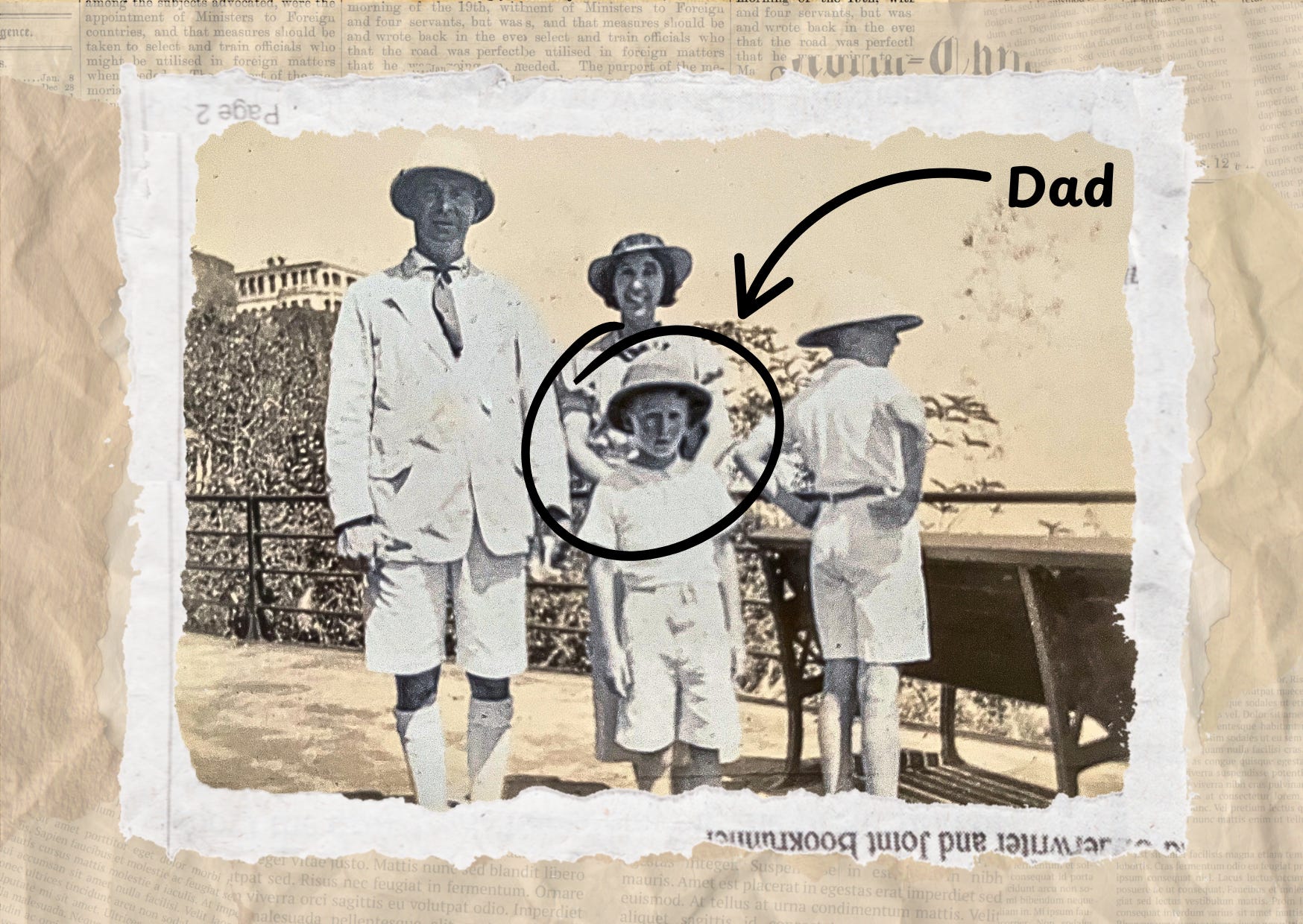
Use one photograph per slide that carries emotional weight; a face, a place, or an object.
Use it as the anchor: everything else on the slide should support that image, not compete with it.
Prompt-to-self: If I could only show this one picture, would it tell part of the story?
Minimal Text, Maximum Punch
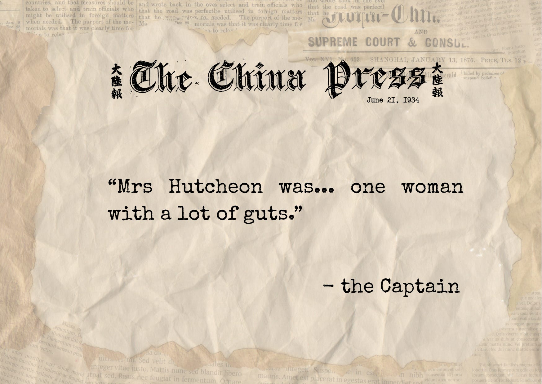
Does the slide need a headline? [Maybe not if you are telling a story. For other presentations consider that if it does, limit text to a headline or short caption: a name, a date, or a single evocative phrase: “Summer 1934”] Think of the text as a label in a museum, enough to orient the audience, but not so much they stop looking at the photo.
Maybe you don’t have an image to illustrate an event. Use a quote or a clipping, but keep it minimalist (see below).
Let the spoken words and the image together carry the story.
Context Without Clutter
Use visual cues instead of paragraphs:
A map outline.
A timeline bar with just one year highlighted.
A small arrow or circle to point out detail in the photo.
The audience should get the who/where/when at a glance, so their attention stays on the storyteller.
Something More
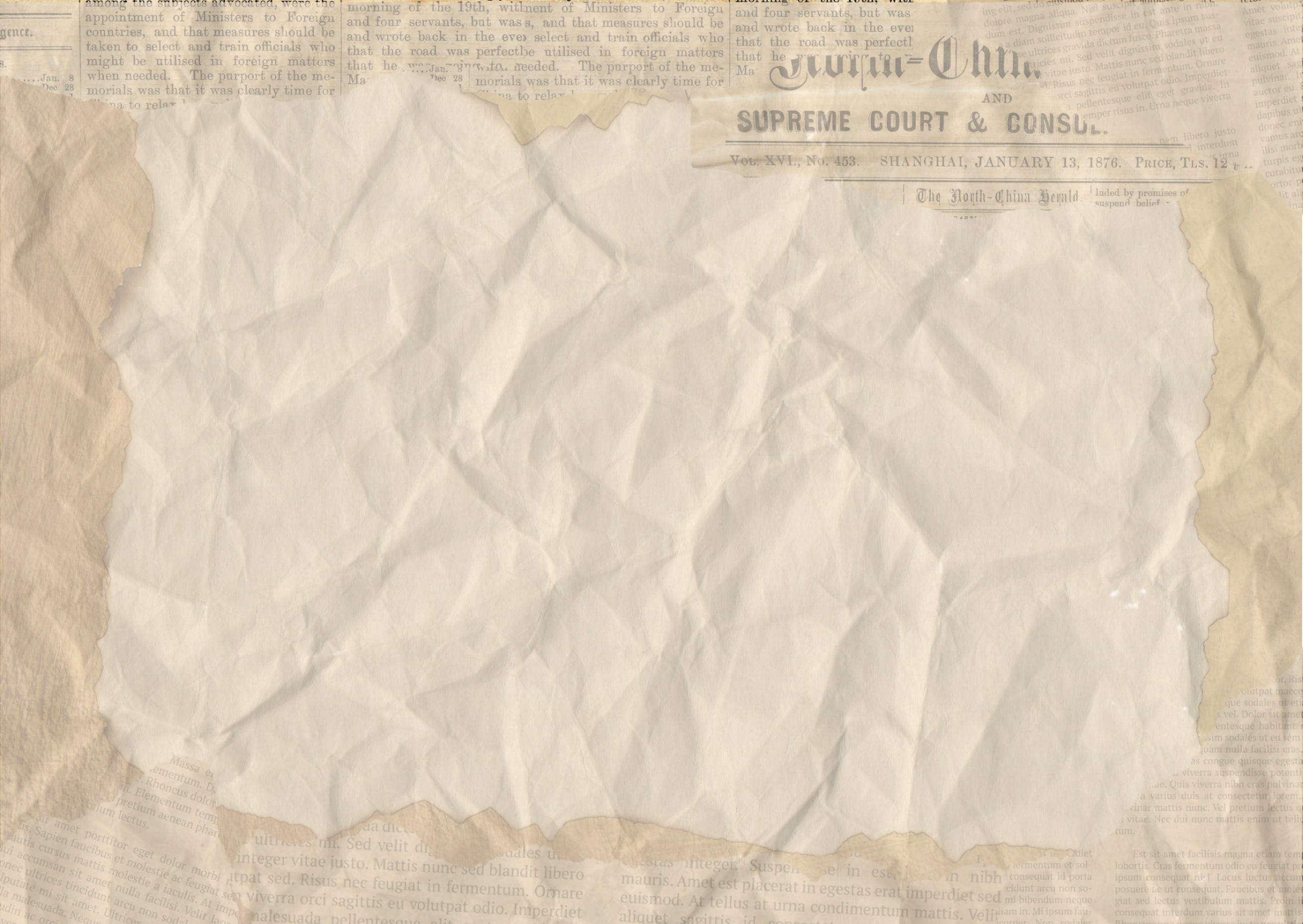
One way I like to get my inner maximalist out (😳) is to create textured backgrounds for my slide shows. As a design aesthetic, I like archival looks, collage and palimpsest, as if I’d put an old photo down on top of a random collection of old papers. To create the background below, I layered elements onto a blank slide. I make sure that the background doesn’t overwhelm, by putting a wash or a kind of film over it or I up the transparency. I’ve made these in Canva.
Dabbling is important to tame excessive tendencies 😁
Before you start your next slide presentation, think about what you’re hoping to achieve. Feel free to check out my RIO tool to help with project planning.
Thanks for reading Show & Tell! Subscribe for free to receive new posts and support my work.